Case Study
5 Mins Read
Improving Web-app Usability and Visual Appeal

Overview
Clearsquare provides an alternative for businesses lacking a dedicated web portal for customer data access. Companies can offer customers secure logins to view and interact with custom reports and dashboards built with their preferred BI tools through a white-labeled dashboard portal. This streamlines data sharing, potentially reducing IT workload and improving customer experience.
Scope
Challenge
The issue on the current interface is difficult to navigate and seems old fashioned. the project goal is Updating an old-fashioned interface to a modern & clean look while maintaining functionality, enhancing usability to simplify task completion, and achieving a visually appealing and consistent design.
Timeline
The duration for the Kick-off meeting, Visual Research, and Initial wireframes is 1 Week, and we do feedback cycles from client internal revision asynchronous per feature within 2.5 Months (Feb-Apr 2023) with Approx. 6 Hours/week
Responsibility
I was responsible for re-designing the interface for all elements within the Clearsquare white-labeled Dashboard Portal ecosystem. In this project, I collaborated with their Project Manager and Tech Lead.
Action
Visual Modernization
Conduct visual research and create a mood board first to get the client's feedback about their desired style. Finally, adopt a minimalistic and clean design approach with ample white space, clean typography, and a simple color palette.
Visual Appeal and Consistency
Building a style guide and component library first and modifying them based on projects needs to make visual consistency across all elements and provide a cohesive user experience
Improving Site’s Navigation
I Made the interface more intuitive and tasks easier to complete by simplifying the app's navigation by redesigning the menu structure and how users interact with each flow
Design Process
Identifying the Problem & Solution Exploration
To enhance user navigation, I explored a range of conceptual solutions. Initially focusing on the core navigation challenge, I conducted competitive analysis and created low-fidelity layouts to visualize potential improvements.
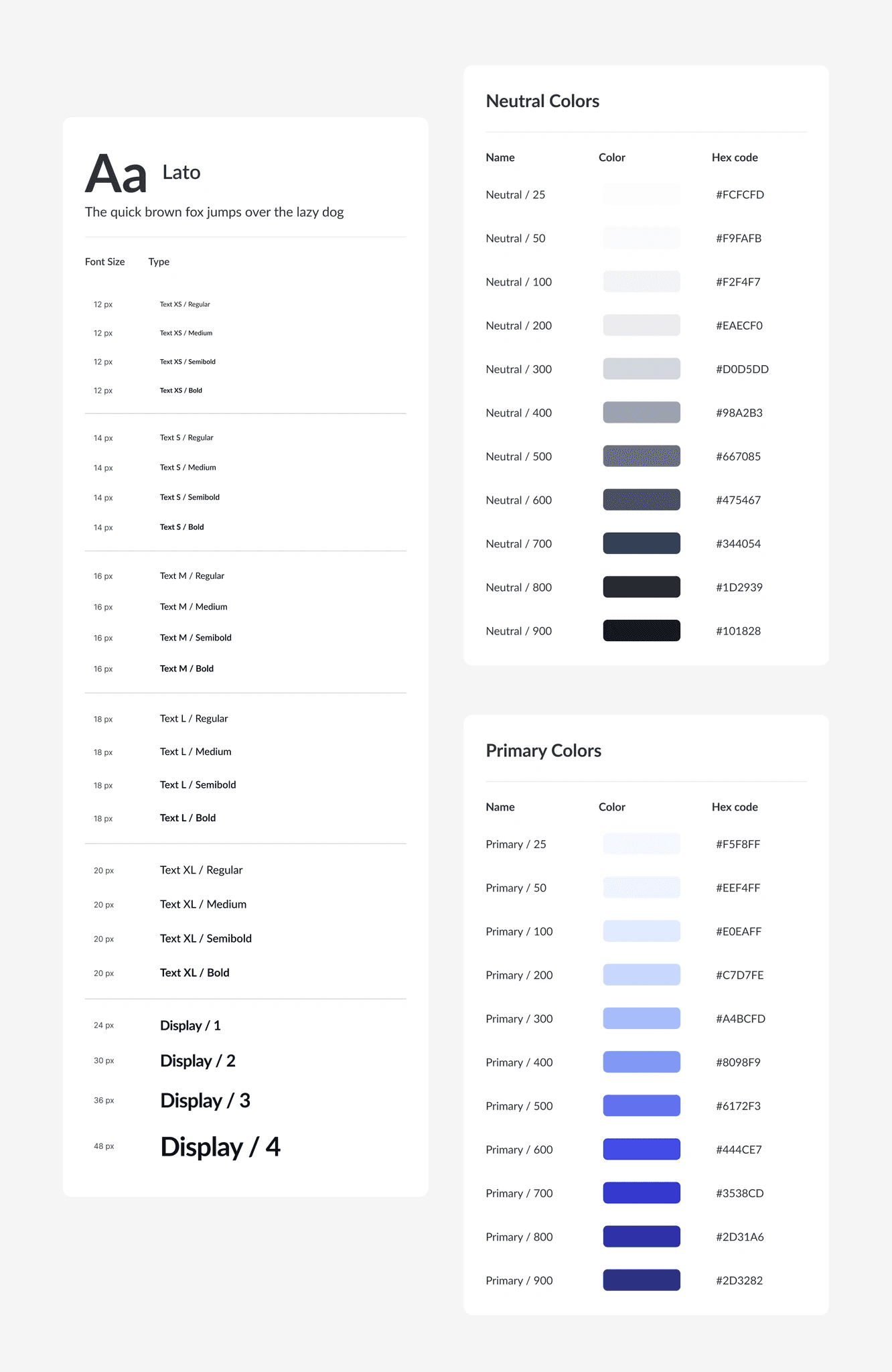
Visual Exploration and Style Definition
To establish a cohesive visual language, I curated a mood board by analyzing minimalist, user-centric designs on Dribbble. This visual foundation informed the creation of a comprehensive style guide to maintain design consistency throughout the web application
High-Fidelity Design and Refinement Concept
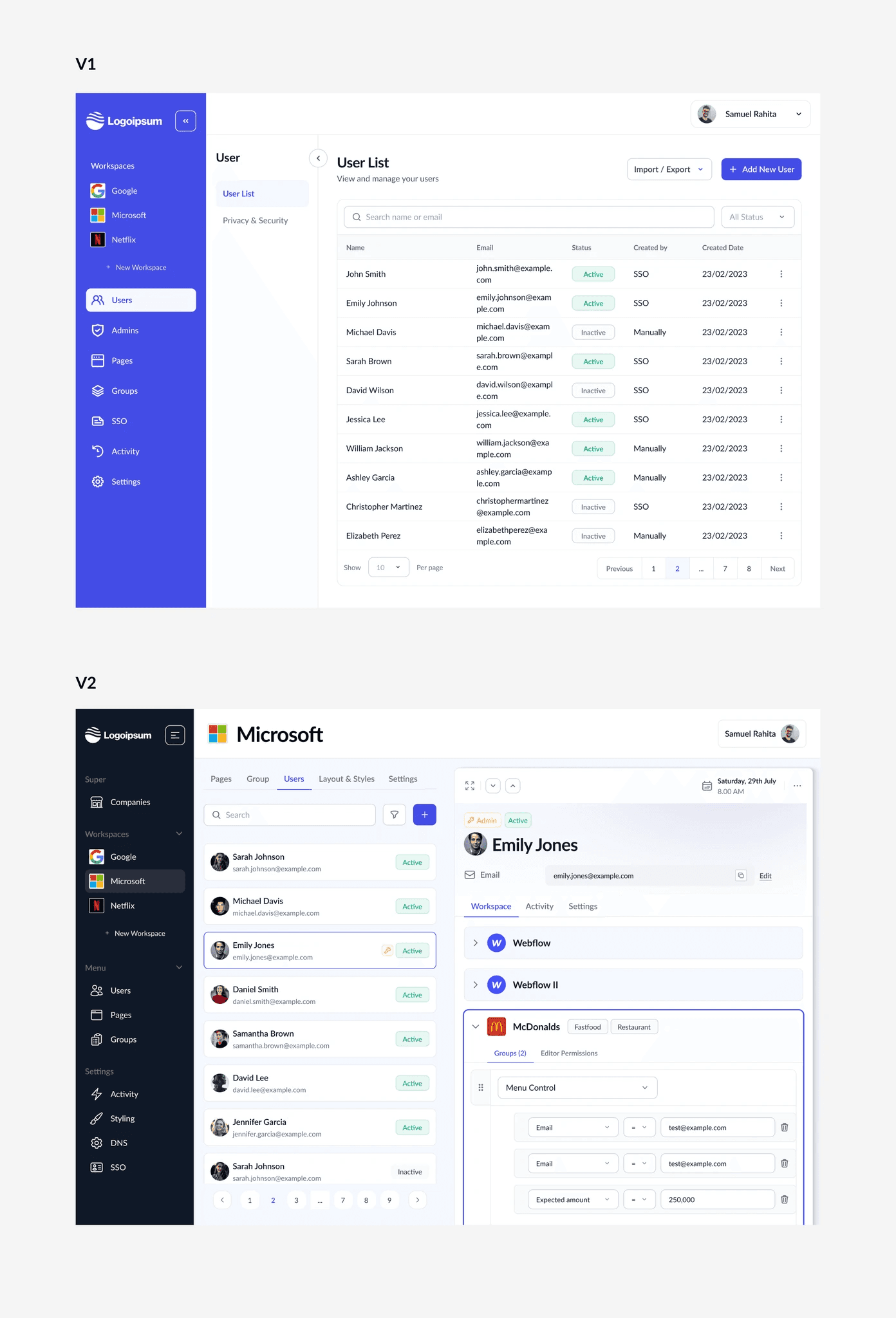
To visualize potential design directions, I created high-fidelity mockups showcasing two design concepts. Through a comparative analysis of their strengths and weaknesses, I selected the v2 concept for its superior menu navigation and expanded it into a comprehensive design system for the remaining screens.
The High Fidelity Solution
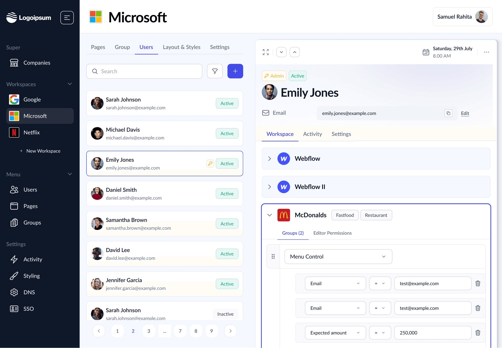
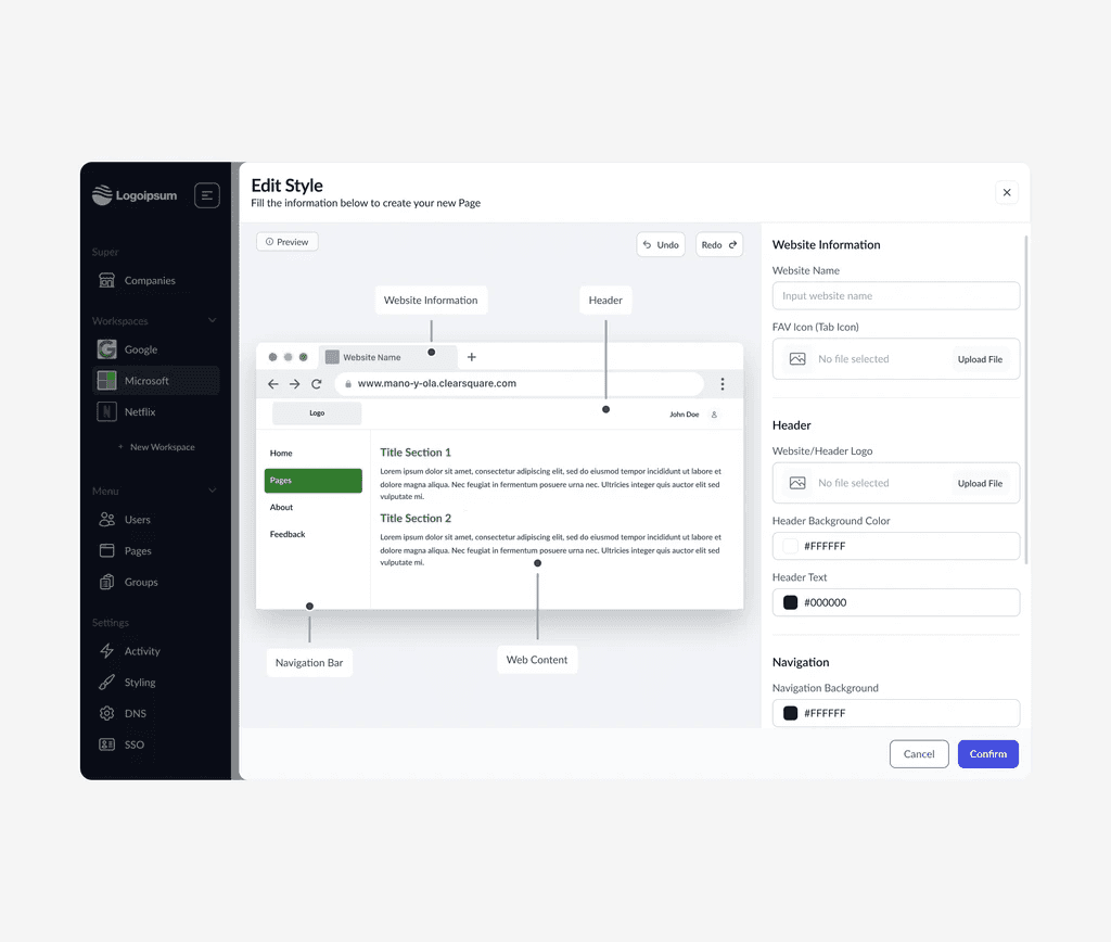
Workspace Management
Streamlined workspace navigation is achieved through a dedicated sidebar for easy switching and management. A tab-based interface within each workspace facilitates smooth menu transitions. This dual-column layout empowers users to focus on task completion in the left pane while simultaneously customizing workspace settings on the right.
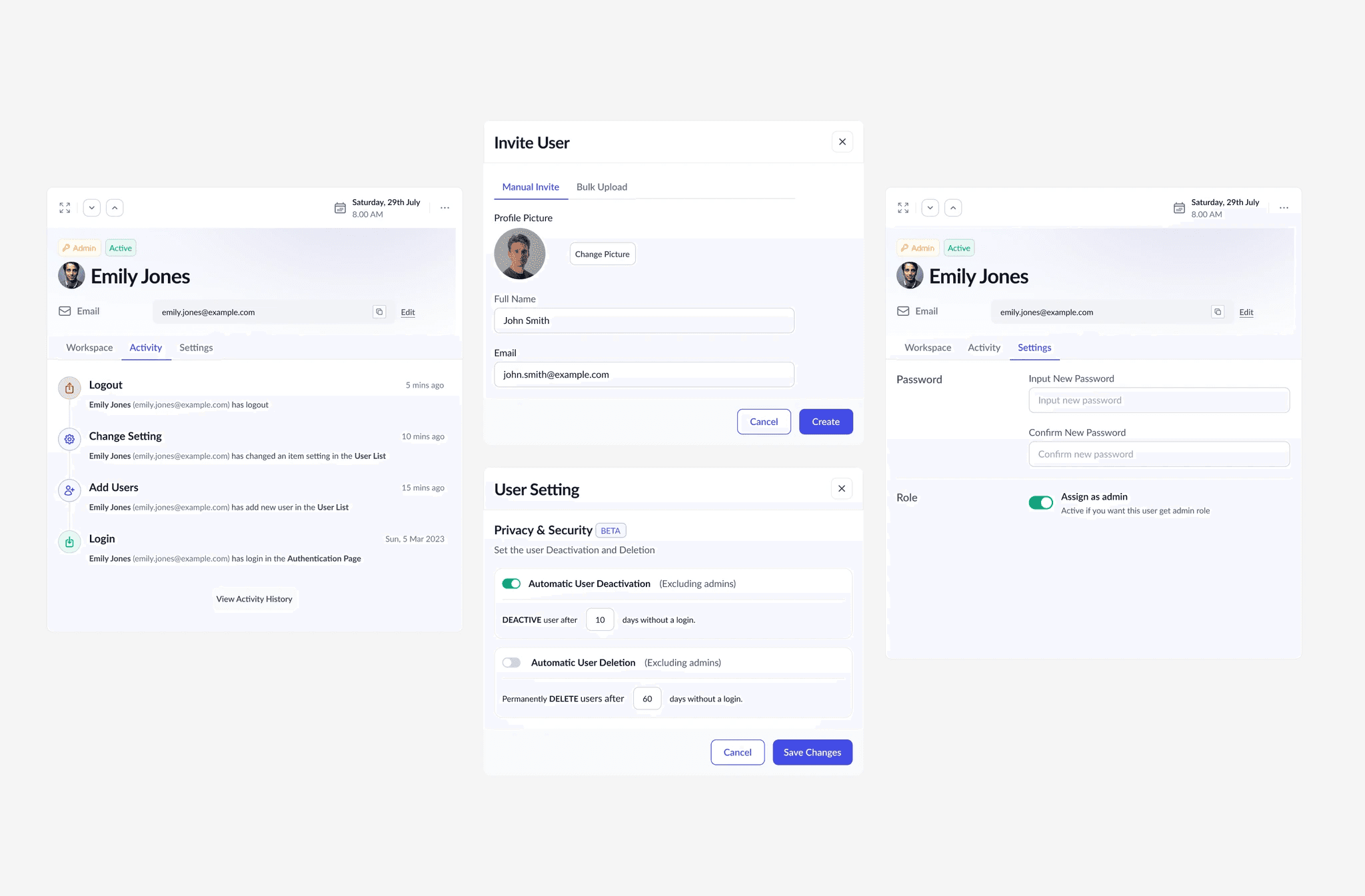
Users Management
Managing users is simplified with a single, unified view. This allows for efficient invitation and management of team members without constantly navigating back and forth. Users can easily switch between different user profiles within this central location.

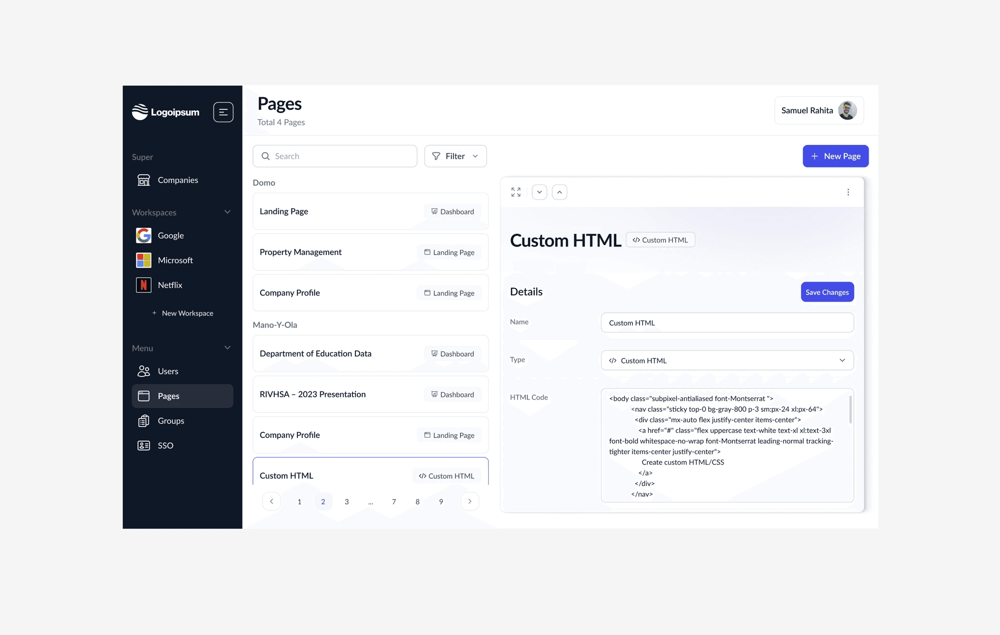
Pages Management
The page management feature offers a centralized location to search, filter, and create new pages. A categorized list of existing pages is displayed on the left, allowing for easy navigation and identification of different page types.
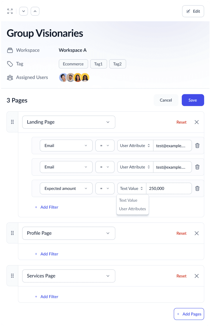
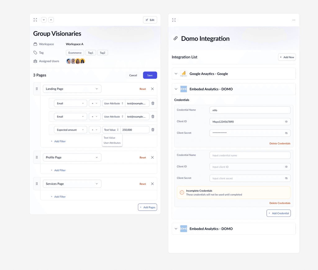
Groups Management
Efficient group management is centralized in a single interface. Admins can effortlessly create new groups and modify user permissions within the same view, streamlining the group management process.

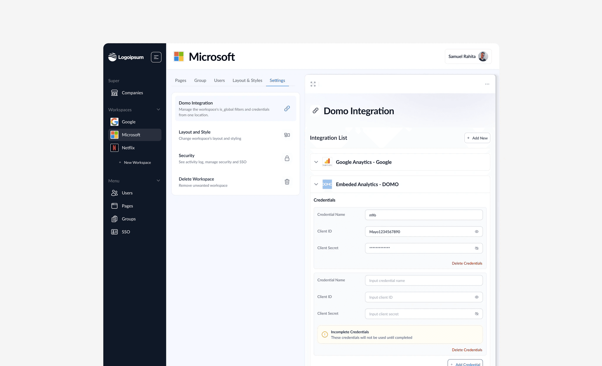
SSO
The platform supports robust SSO configuration, allowing for seamless integration with external identity providers. A visual customization interface empowers administrators to tailor the SSO login experience to match the application's branding and user preferences.

Key Takeways
A comprehensive style guide ensured visual consistency, resulting in a seamless user experience. Achieved through close collaboration with the Project Manager and Tech Lead, this project significantly increased user satisfaction and efficiency, exemplifying my ability to transform interfaces while aligning with technical feasibility and project goals.
Next